Website redesign
Freshbites
Website redesign
Freshbites
About this Project
Freshbites, situated in Mississauga, Toronto, specializes in serving up a menu featuring sandwiches, burgers, salads, and snacks.Their primary audience is those who wants customizable, health-conscious meals at a budget-friendly price.
However, the website design lacks the essential features. The menu, presented as images, lacks interactivity and information, lacks images of food and descriptions, making browsing challenging.
Project Duration: 4 Weeks
School Project
Role : UI Designer | UX Researcher
Overview
Step
01
Problem Statement
The user faces challenges in existing website due to non-interactive picture menus, poor content, and a lack of aesthetic appeal. It limits content to one page, lacks information architecture, and orders food from a third party website. User experience is greatly impacted by these problems, requiring a complete redesign and improvement.
Step
02
Solution
Improve the website's appearance, add interactive menus, and improve the quality of the content.
Address problem of not having information architecture, and allowing user to order food through third-party systems to greatly improve the user experience.
Step
02
Solution
Improve the website's appearance, add interactive menus, and improve the quality of the content.
Address problem of not having information architecture, and allowing user to order food through third-party systems to greatly improve the user experience.
Step
03
Objective
Redesign existing website to improve the visual appeal.
Enhance website functionality to help users to easily order food.
Introduce various pathways to help users easily navigate and access pages on the website.
Step
03
Objective
Redesign existing website to improve the visual appeal.
Enhance website functionality to help users to easily order food.
Introduce various pathways to help users easily navigate and access pages on the website.
Discover
Step
01
Initial Assessment
Started by analyzing the existing website.
Identified three main issues: non-interactive picture menus, poor content and aesthetics, and limited content with no information architecture.
Step
01
Initial Assessment
Started by analyzing the existing website.
Identified three main issues: non-interactive picture menus, poor content and aesthetics, and limited content with no information architecture.
Step
02
User Interviews
Conducted interviews with current users of the website to understand pain points and preferences.
Gathered insights on the challenges faced, such as difficulty navigating the menu and dissatisfaction with the overall user experience.
Conducted current state usability test.
Step
02
User Interviews
Conducted interviews with current users of the website to understand pain points and preferences.
Gathered insights on the challenges faced, such as difficulty navigating the menu and dissatisfaction with the overall user experience.
Conducted current state usability test.
Step
03
Competitor Analysis
Identified successful design patterns and functionalities, user-friendly features and effective content presentation.
Extracted best practices that could be applied to enhance the user experience.
Step
03
Competitor Analysis
Identified successful design patterns and functionalities, user-friendly features and effective content presentation.
Extracted best practices that could be applied to enhance the user experience.
Define
Define
Define
One of the major problem identified during the current state suability test was that the participants faced difficulties in navigating through the website. To fix this problem we decided to improve information architecture as follows.
Step
01
Card Sorting
Conducted card sorting exercise with 5 potential users.
This helped us to understand how users group information and form category.
This was used as the basis to build information architecture.
Step
01
Card Sorting
Conducted card sorting exercise with 5 potential users.
This helped us to understand how users group information and form category.
This was used as the basis to build information architecture.
Step
02
Information Architecture
Developed a finalized IA based on the card sorting results and incorporating best practices.
Prioritized user-friendly navigation to address the lack of a proper navigation bar on the existing site.
Organized content logically, making it easier for users to find information and navigate the menu.
Step
03
User Flow Diagram
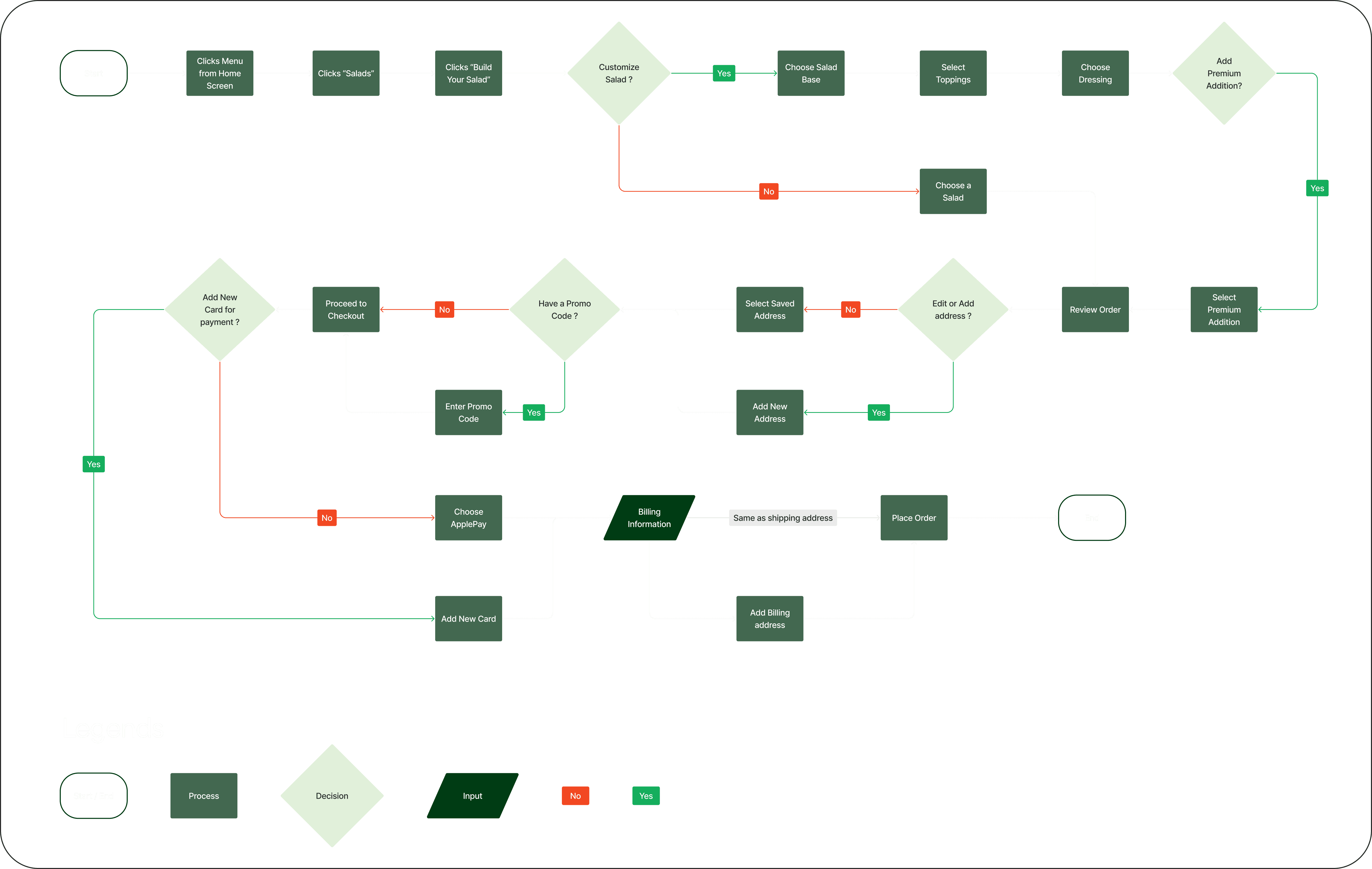
If we implement the above navigation system, the user would follow the below shown path to reach their goal (here, buy a customised salad).
● This user flow diagram helps visualize the journey users take through the website.
● Highlighted key interactions, decision points, and the flow from menu exploration to placing an order
Step
03
User Flow Diagram
If we implement the above navigation system, the user would follow the below shown path to reach their goal (here, buy a customised salad).
● This user flow diagram helps visualize the journey users take through the website.
● Highlighted key interactions, decision points, and the flow from menu exploration to placing an order
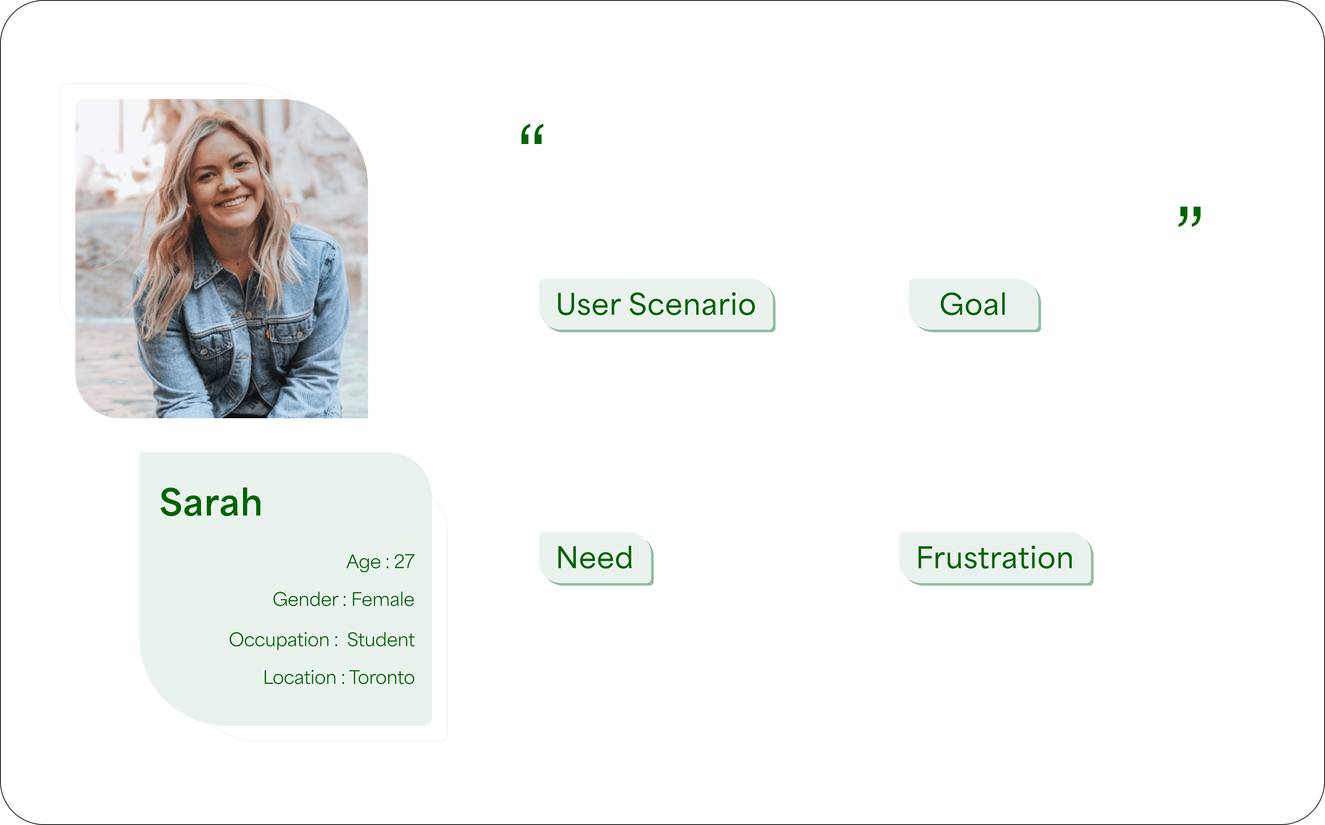
User Persona
User Persona
User Persona
Ideate and Prototype
Ideate and Prototype
Ideate and Prototype
Step
01
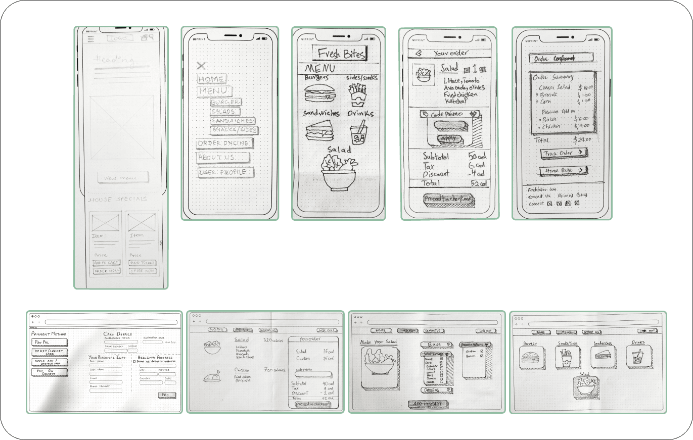
Paper Prototyping
● The ideation phase kicked off with the creation of paper prototypes. This hands-on approach allowed for quick ideation and iteration, understanding of the potential user interface.
● Key functionalities and layout elements were sketched on paper, enabling a rapid exploration of design concepts and user flow scenarios.
Step
01
Paper Prototyping
● The ideation phase kicked off with the creation of paper prototypes. This hands-on approach allowed for quick ideation and iteration, understanding of the potential user interface.
● Key functionalities and layout elements were sketched on paper, enabling a rapid exploration of design concepts and user flow scenarios.
Step
02
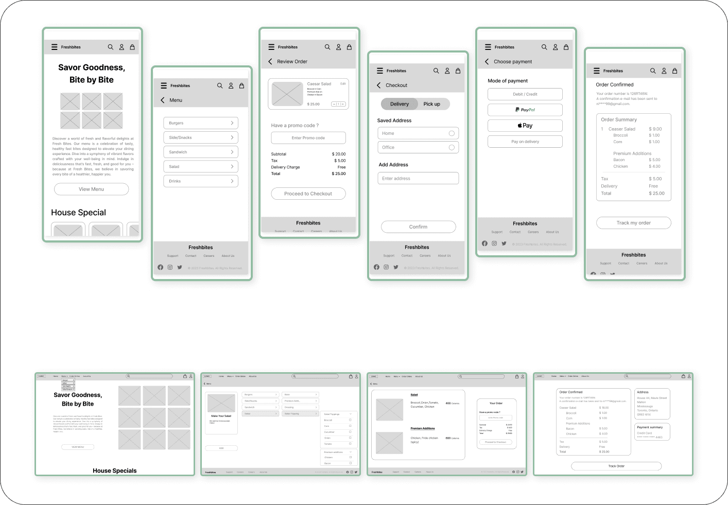
Lo-Fi Wireframes
● At this stage, we focused on refining the layout, organizing information, and planning how users would interact with the design.
● Based on paper prototypes, we made low fidelity wireframes which converted our ideas into a digital outline, forming the basic structure for the website redesign.
Step
02
Lo-Fi Wireframes
● At this stage, we focused on refining the layout, organizing information, and planning how users would interact with the design.
● Based on paper prototypes, we made low fidelity wireframes which converted our ideas into a digital outline, forming the basic structure for the website redesign.
Design Systems & Guidelines
Design Systems & Guidelines
Design Systems & Guidelines
Step
01
Colors & Typography
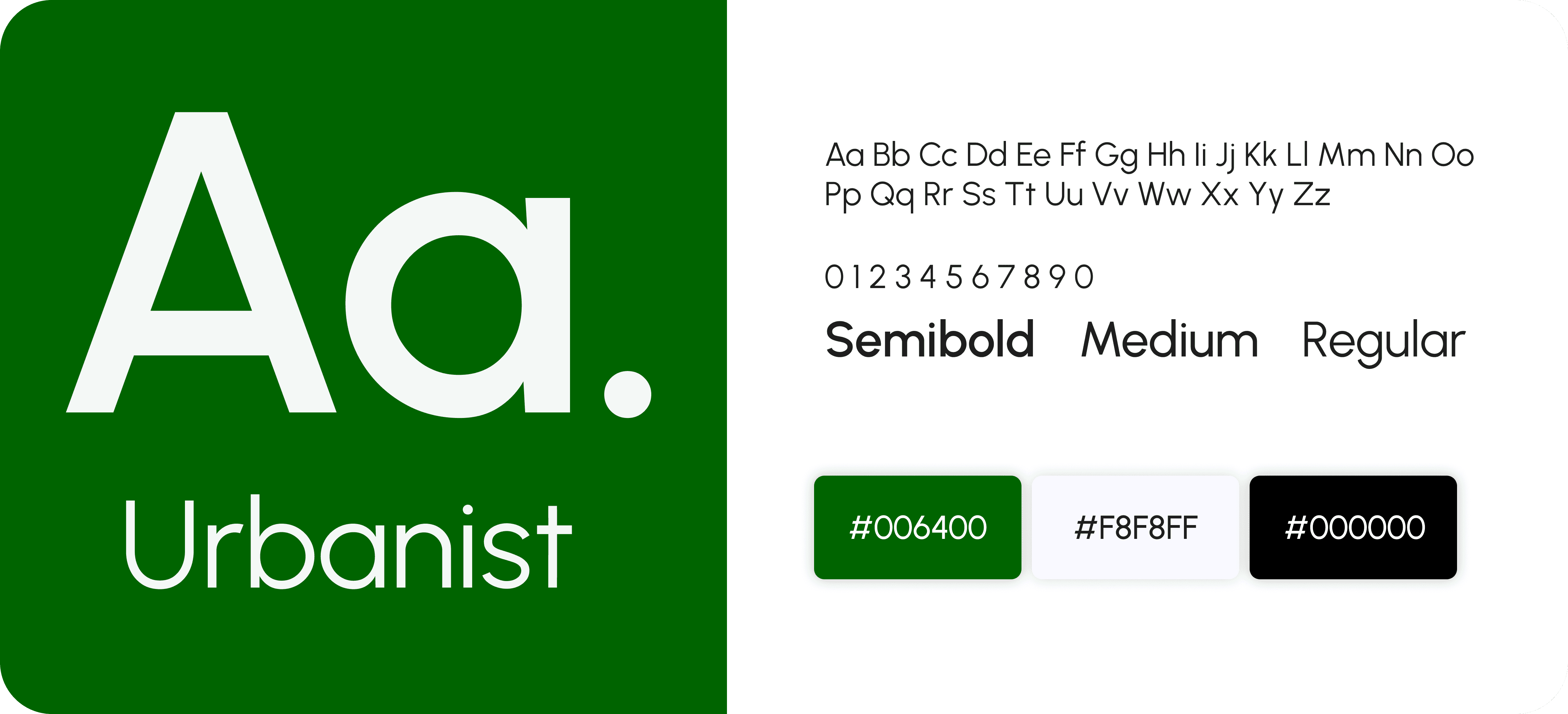
We chose green as our main color because it symbolizes freshness, health and calm, which all match our restaurant's vibe. Using shades of green on the website aims to make visitors feel refreshed and connected to our focus on fresh and healthy food and making our site welcoming and cozy for everyone.
For the typography, we chose Urbanist for its simplicity and minimalism, perfectly complementing the clean, modern look we aim for in our website redesign. Its sleek lines and contemporary feel enhance readability, ensuring a smooth browsing experience on any device. Urbanist's versatility helps us maintain a professional and elegant appearance while effectively delivering essential information.
Step
01
Colors & Typography
We chose green as our main color because it symbolizes freshness, health and calm, which all match our restaurant's vibe. Using shades of green on the website aims to make visitors feel refreshed and connected to our focus on fresh and healthy food and making our site welcoming and cozy for everyone.
For the typography, we chose Urbanist for its simplicity and minimalism, perfectly complementing the clean, modern look we aim for in our website redesign. Its sleek lines and contemporary feel enhance readability, ensuring a smooth browsing experience on any device. Urbanist's versatility helps us maintain a professional and elegant appearance while effectively delivering essential information.
Step
02
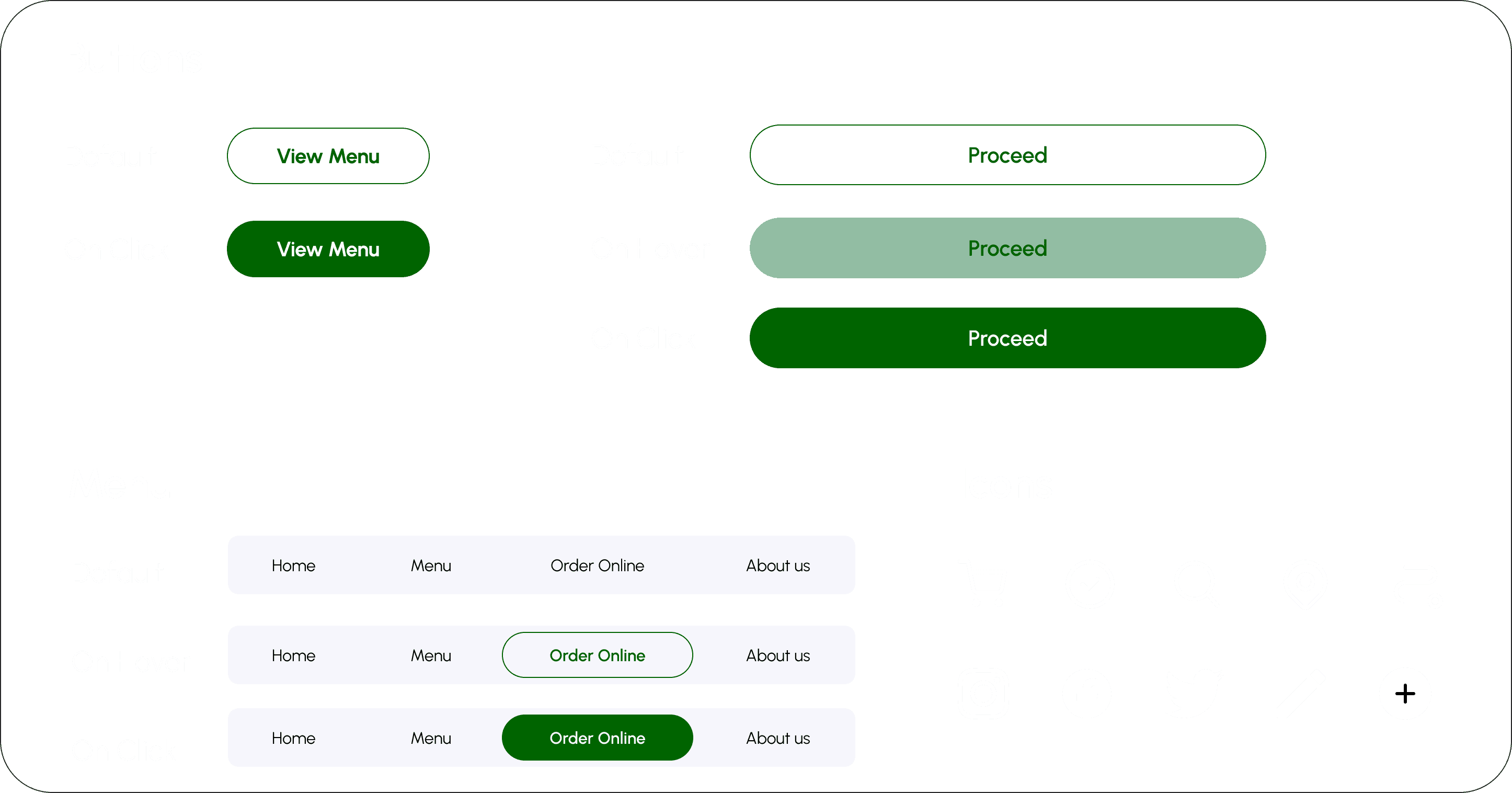
UI Kit Elements
Step
02
UI Kit Elements
Final Design
Final Design
Final Design
Step
01
Colors & Typography
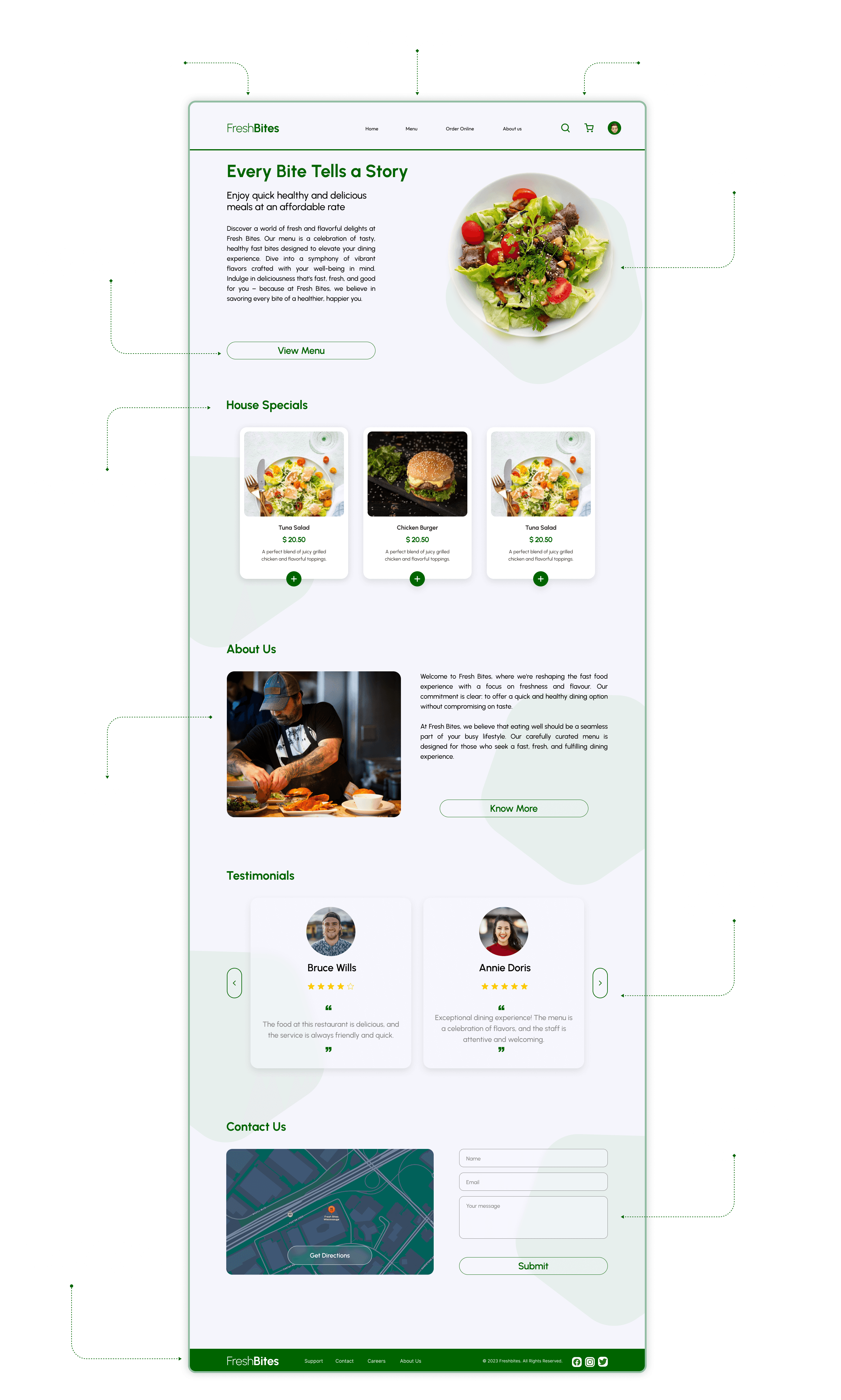
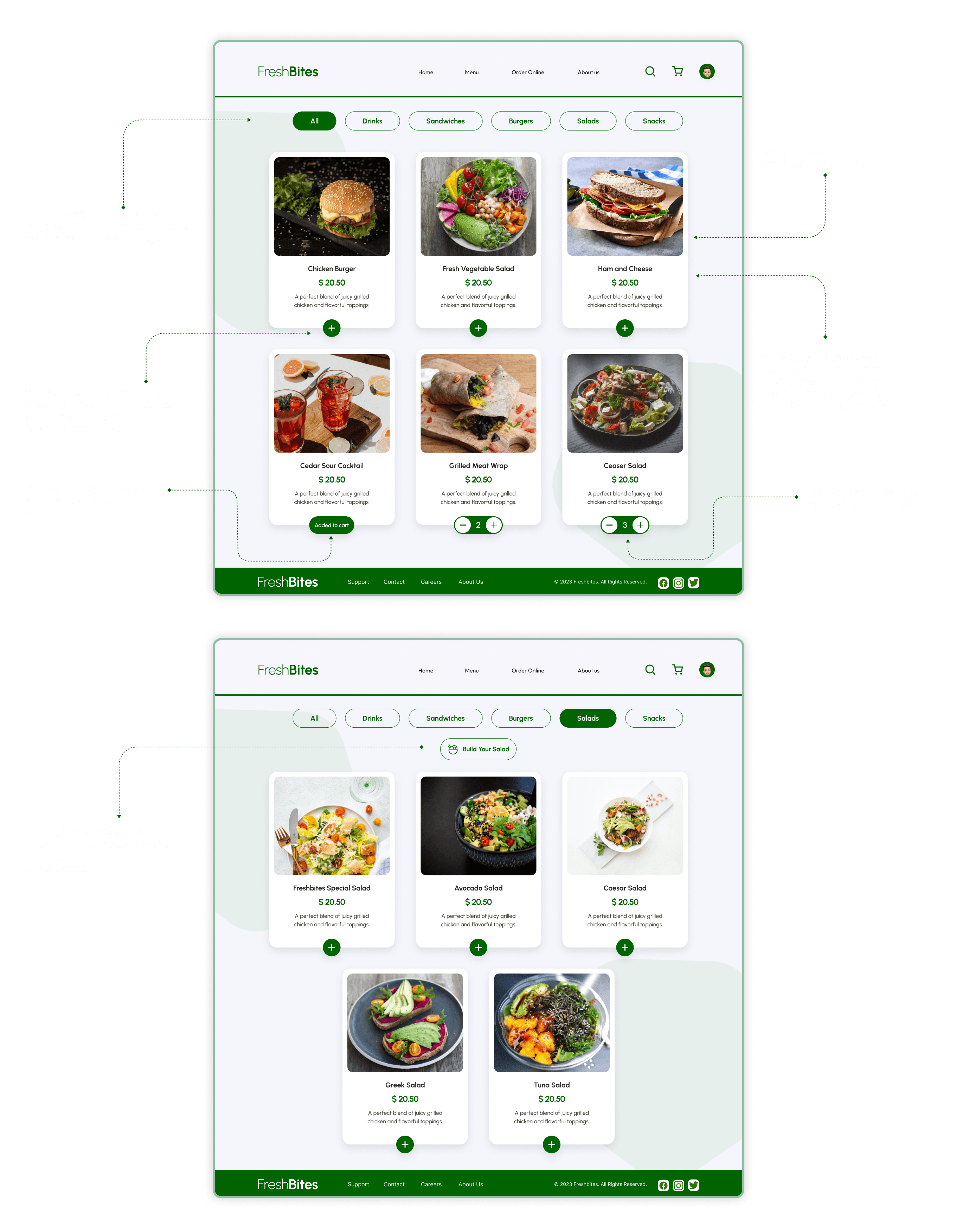
Based on the feedback obtained during usability testing, iterative design changes were implemented.This iterative process involved refining the lo-fi wireframes to better align with user preferences and expectations. Usability issues were addressed, and improvements were made to enhance the overall user experience, resulting in a polished and user-friendly look. The final detailed design incorporated visual elements, refined the interface, and had a cohesive look.
Step
01
Colors & Typography
Based on the feedback obtained during usability testing, iterative design changes were implemented.This iterative process involved refining the lo-fi wireframes to better align with user preferences and expectations. Usability issues were addressed, and improvements were made to enhance the overall user experience, resulting in a polished and user-friendly look. The final detailed design incorporated visual elements, refined the interface, and had a cohesive look.
Step
02
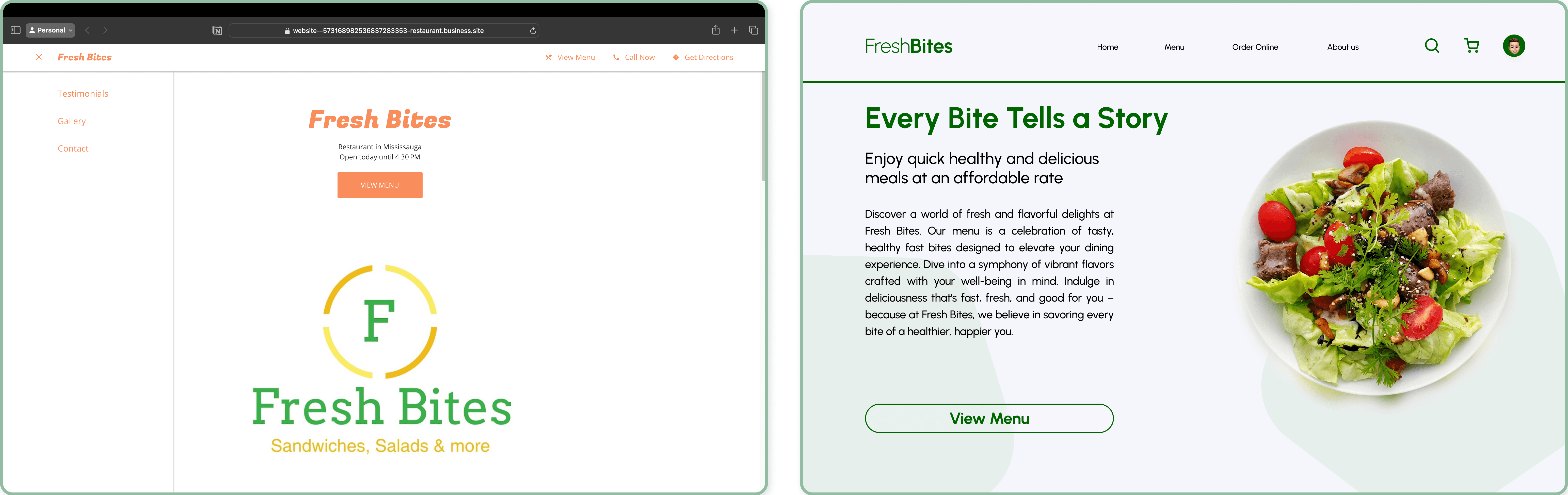
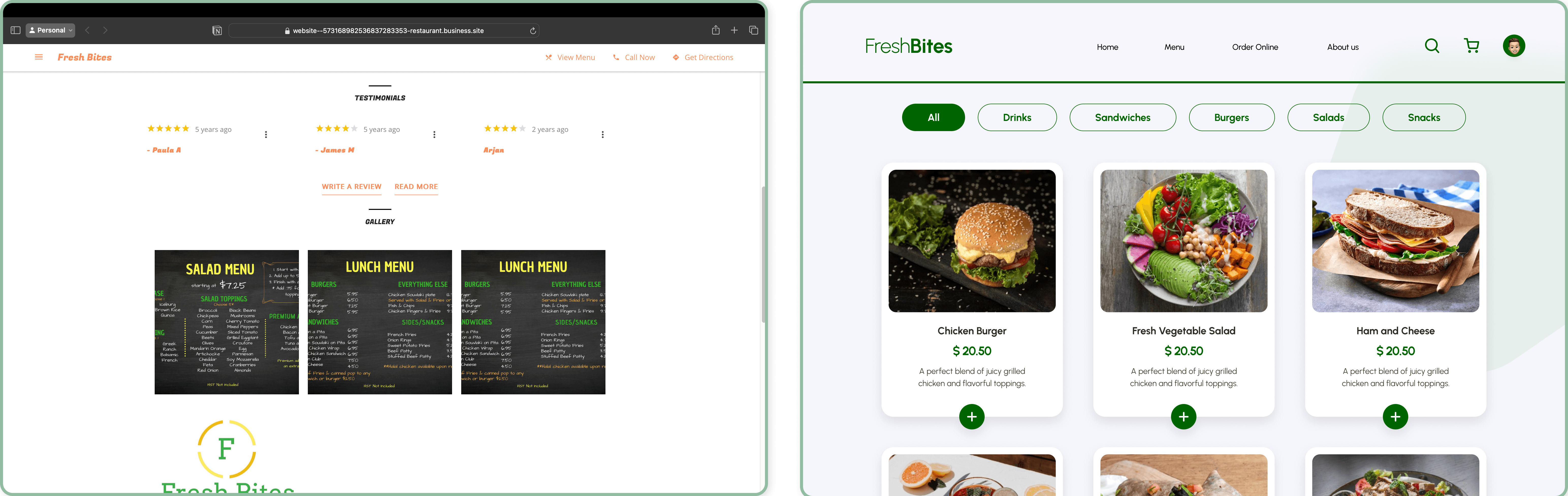
Before & After
Step
02
Before & After
Step
02
Detailed View
Step
02
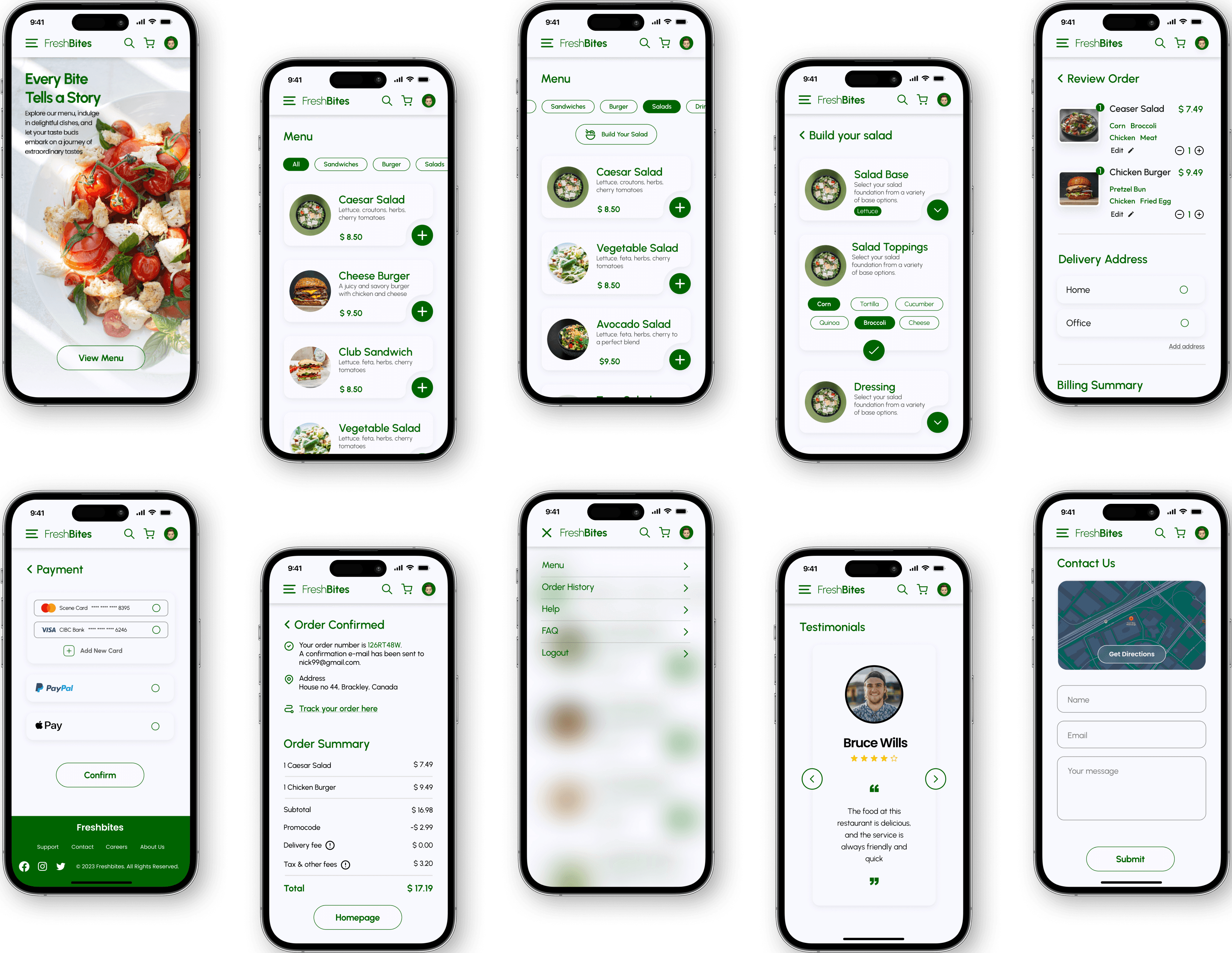
Mobile UI
Step
02
Mobile UI
Key Takeaways
Key Takeaways
Challenges
Enhancing the current website's UI by addressing issues like the lack of online ordering and poor navigation.
Creating the information architecture (IA) due to the limited amount of navigation content available.
Creating user journey for the website redesign due to the limited availability of real user data.
Maintaining cohesive design while collaborating as a team.
What I Learned
Collaborative working towards common goal of delivering an effective project.
What I Learned
Collaborative working towards common goal of delivering an effective project.
Key Takeaways
Challenges
Enhancing the current website's UI by addressing issues like the lack of online ordering and poor navigation.
Creating the information architecture (IA) due to the limited amount of navigation content available.
Creating user journey for the website redesign due to the limited availability of real user data.
Maintaining cohesive design while collaborating as a team.
What I Learned
Collaborative working towards common goal of delivering an effective project.